
Burt’s Bees
Skincare
Designer
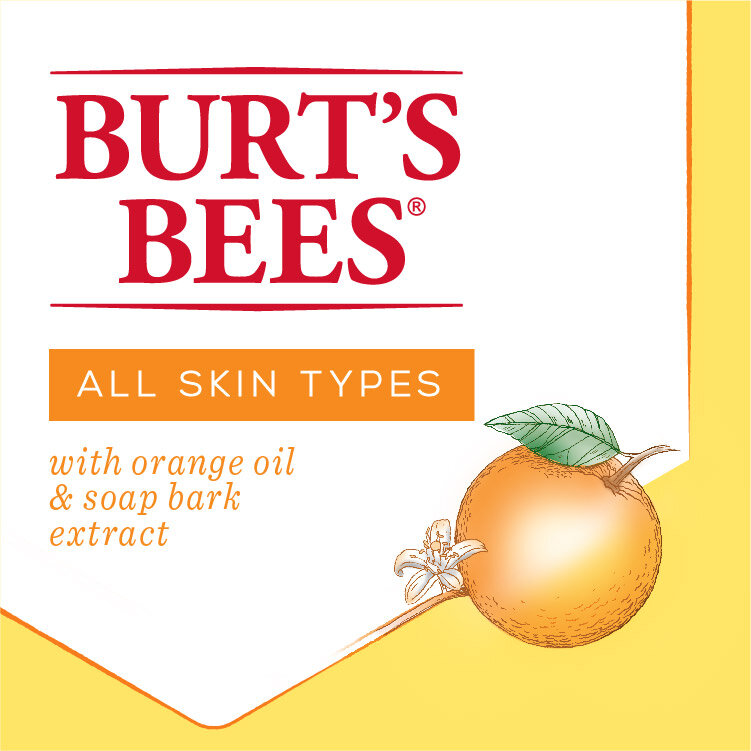
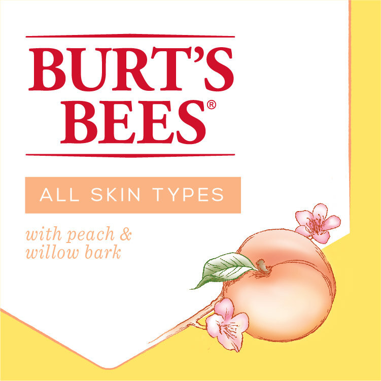
Burt’s Bees had a unification problem. While they loved the authenticity of their current packaging and woodcut illustrations, they were lacking a consistent system which caused confusion on the shelf. We came up with a system rooted in their bee-hive identity by incorporating key ingredients in a hexagon holding shape. Areas of focus included illustration retouching, developing a branding system and overall refreshing the packaging. While this particular design didn’t make it to shelf, it was one of my favorite design outtakes.


Role: Designer
Creative Direction: Adrienne Muken
Design Direction: Aimee Kenline
Agency: CBX